Reading Time: 6 minutes
TL;DR
Team misalignment costs you time, money, and morale—it’s an invisible “Alignment Tax” paid through duplicated work, missed deadlines, and constant redos. A one-page visual map solves this by creating a single source of truth that shows everyone how their work connects to the bigger picture. It transforms abstract strategy into clear, actionable steps and cuts alignment meetings by up to 50%. You don’t need design skills—just clarity and commitment to get everyone literally on the same page.
Introduction
Let’s play a game.
Ask five people on your team what the number one priority is for this quarter.
Go ahead, I’ll wait.
If you’re like most leaders, you’ll get five different answers.
It’s the most common—and most expensive—problem in business: alignment chaos. Everyone is busy, but nobody is pulling in the same direction. Your brilliant strategy isn’t a strategy if it’s buried in a 50-page document. It’s just noise.
What if you could get everyone on the exact same page? A single, clear, visual page that acts as your team’s North Star.
That’s the power of a one-page visual map. It’s not just a document; it’s your team’s compass.
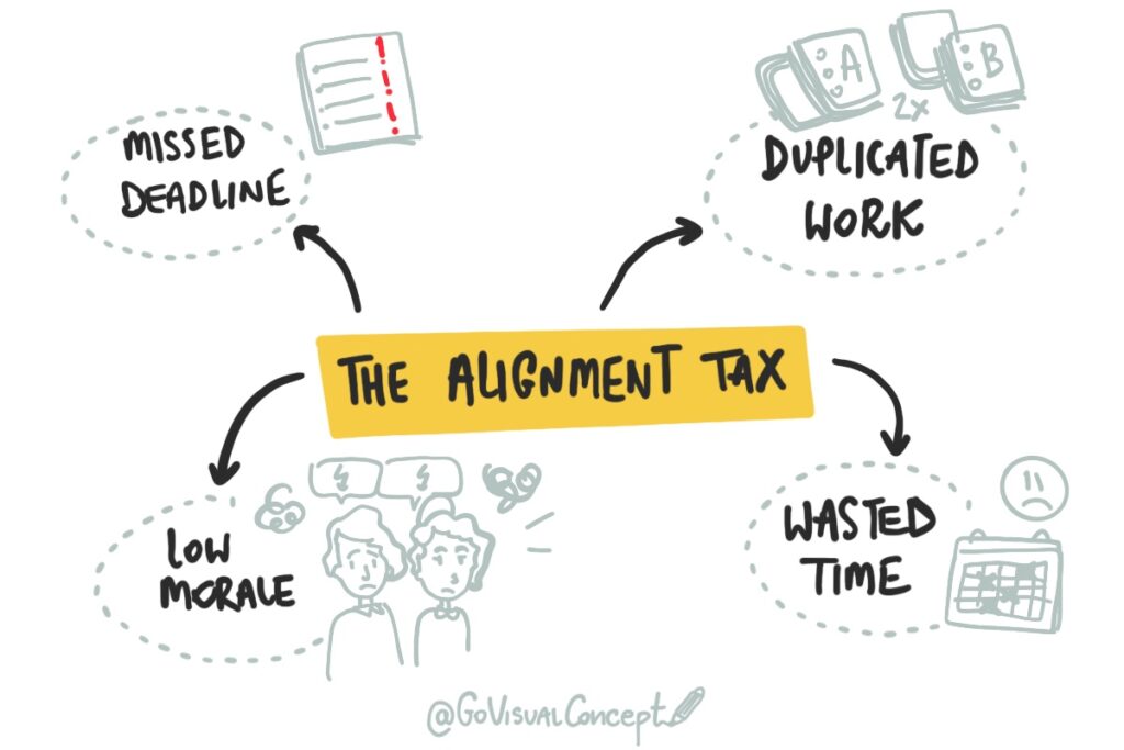
The True Cost of Misalignment (The “Alignment Tax”)
This isn’t just frustrating; it’s incredibly expensive. A study by the Project Management Institute (PMI) found that a primary driver of project failure is a lack of clearly defined objectives.
When your team is misaligned, you are actively paying an “Alignment Tax.”
- You pay it in duplicated work.
- You pay it in missed deadlines.
- You pay it in features nobody needed.
- You pay it in the soul-crushing “redo” cycle that burns out your best people.
Words alone don’t build alignment. They invite misinterpretation. To get everyone on the same page, you need to show them the map.
How a One-Page Map Solves It: The 3 Pillars of Clarity
A one-page visual map acts as a powerful antidote to chaos. It transforms your strategy into a tool that people actually use.
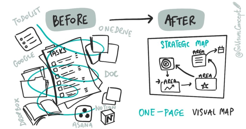
1. It Creates a Single Source of Truth
- BEFORE: Your strategy is scattered across slide decks, emails, and project tools. No one knows which document is the “real” one.
- AFTER: There is one map. It hangs on the wall (digital or physical). It is the single, undeniable source of truth. When a question arises, everyone points to the same page.
2. It Drives Shared Ownership
- BEFORE: Team members work in silos, focused only on their individual to-do lists.
- AFTER: The map shows how everyone’s work connects. The marketing team can see how their actions impact sales. This “big picture” view stops people from saying “that’s not my job” and starts them on “how can we make this work together?”
3. It Translates Strategy into Action
- BEFORE: You have high-level “strategic goals” that feel vague and disconnected from daily work.
- AFTER: The map visually links the big “Why” (the vision) to the “What” (key projects) and the “Who” (team ownership). It becomes an actionable dashboard that makes it clear what to do next.
Case Study: The Marketing Team That Couldn’t Launch
A fast-growing tech company had a problem. Their multi-channel marketing launches were constantly delayed. The product, content, and paid ads teams were brilliant but completely out of sync.
- The Visual Fix: We held a 2-hour Clarity Session and mapped their entire launch process on one visual canvas. We defined key milestones, dependencies, and owners for each stream.
- The Results: For the first time, the content team saw how their delay was holding up the entire ad campaign. The map became their central dashboard for weekly check-ins.
- Their very next launch was the smoothest in company history.
- They cut their repetitive “alignment meetings” by 50%.
- The team reported higher confidence and a clear sense of “our mission.”
Quick-Start Guide: How to Create Your Own Mini-Map
You don’t need special tools or drawing skills — just a marker, paper, and focus.
- Define your North Star: What’s the main goal or outcome? What does “done” look like?
- Map where you are now: Key projects, challenges, or assets.
- Connect the dots: Draw lines between what supports or blocks your goal.
- Highlight priorities: Circle the 3 things that move the needle the most.
- Share it visually: Review the map together and update it regularly. It’s a living document!
❓ FAQ: Visual Maps for Teams
1. What’s the difference between a visual map and a mind map? A mind map is for brainstorming (exploring ideas out). A strategic visual map is for alignment (getting everyone on the same page). It’s goal-oriented and actionable.
2. Can’t an AI tool just generate a summary for us? AI can give you a summary of what was said. A visual map creates a shared understanding of what needs to be done. It’s a tool for human connection, commitment, and alignment—things AI can’t replicate.
3. Do we need to hire a designer or can we do it ourselves? You can absolutely start with a simple hand-drawn version. A professional facilitator (like Go Visual Concept) is brought in to refine it, scale it, and guide the strategic conversation around it.
4. How often should a visual map be updated? At least quarterly—or any time your priorities shift. It’s a living document, not a static poster.
5. What tools can we use for digital maps? Miro, FigJam, and Mural are fantastic. But you can start with paper and a camera. The tool matters less than the clarity it creates.
Next Steps: From Seeing to Acting
If your team keeps having the same conversations without progress, it’s time to get everyone on the same page—literally.
🎯 Ready for deeper clarity? Book a Visual Clarity Session — a 90-minute strategic visualization that turns your team’s chaos into a one-page map of priorities and actions.
👉 Let’s draw your clarity together. [Book now]